
You know that sinking feeling when you land on a website and immediately want to leave?
Maybe the buttons are hidden, the navigation makes no sense, or it just feels... off.
That is not just bad design, it is money walking out the door.
Here's something that might surprise you: a well-crafted user interface can boost conversion rates by up to 200%.
And if you think that is impressive, you must understand that every dollar invested in UX returns $100, giving you a 9,900% ROI.
That is not a typo.
But most decision-makers still treat UI/UX as an afterthought, something to polish up before launch rather than a weapon that directly impacts revenue.
Let us change that thinking with this article because the numbers don't lie and your competitors are already catching on.
How UI/UX Design Shapes User Behavior Throughout the Funnel?
We all have experienced that good UI/UX design guides users smoothly from awareness to purchase.
Bad design, on the other hand, creates roadblocks at every step that may even break the trust that your brand has earned.
Let's see exactly where bad design hurts your funnel in detail and why it matters for your business.
How bad designs impact Top of Funnel (TOFU)?
At the top of the funnel, users might not know you.
They land on your page, glance around, and make a judgment whether to stay or leave in just seconds.
Every headline and even delay matters here. Bad design when targeting them means losing them forever.
Have a look at how it impacts:
High Bounce Rates
If a page load speed goes from 1s to 3s, the bounce rate might increase up to 32%.
Therefore, chances are very high that first time visitors leave instantly before you even get a chance to show your value to them.
Loss of Credibility
Outdated visuals, broken buttons, and inconsistent UI make your brand feel unreliable.
Senior execs are especially unforgiving here because first impressions shape whether they trust your product or services.
Lower Engagement Hurting Organic Reach and SEO
Google rewards sites that users stay on. Bad design leads to fast exits that tell search engines “this site is not useful”.
As rankings fall, your company becomes less discoverable, and you end up spending more on ads.
How bad designs impact Middle of Funnel (MOFU)?
Once users reach the middle of the funnel, they are evaluating. They are asking: Does this solution fit my needs? Can I trust it?
Hence, while targeting them, UX designs must be about reassurance and ease of evaluation. This stage turns interest into intent.
Let us understand its impact:
Collapse in Product Understanding
When design fails to communicate value clearly, users simply cannot see how your solution fits their needs.
Hence, they walk away believing you don’t solve their problem even when you genuinely do.
Erosion of Trust and Confidence
At MOFU, users are looking for reassurance. Bad design makes your product feel immature or unstable.
Executive buyers, especially in B2B, are quick to abandon anything that signals risk.
Competitor Vulnerability Window
During MOFU evaluation, users are actively researching alternatives.
Every moment of confusion or frustration with your design is an opportunity for competitors to intercept.
How bad designs impact Bottom of Funnel (BOFU)?
This is the most painful leak because the user is already convinced.
They want to make a purchase but bad design can be one of the reasons that stops them right before the finish line.
See its impact in detail:
Lost Revenue at Checkout
Users are ready to buy at this stage but confusing or broken payment flows make them abandon at the last step.
They want to make a purchase but bad design might stop them. This directly translates to lost revenue from ready-to-buy customers.
Smaller Deal Sizes
Confusing pricing pages or unclear product tier differences make buyers choose cheaper plans than they actually need.
Or worse, this gives them leverage to negotiate discounts. Either way, bad UI/UX design directly reduces the value each customer is willing to pay.
Confused Buyers with Information Overload
Cluttered pages with too many options, pop-ups, or confusing layouts overwhelm customers who have already made their purchase decision.
They have to work too hard to figure out what to do next. This confusion makes them abandon the purchase even though they wanted to buy.
Conversion-Focused Design Principles Every Leader Should Know
Now let's get practical.
Not every design principle truly drives conversions. Some make your product prettier.
Others directly influence buying behavior, decision-making and user confidence.
The principles below are the ones that move the needle and every decision maker should understand them before approving a design direction.
1. Hick's Law: Less is More (Literally)
When you give users too many options, they freeze and don't buy anything.
This is a proven psychology. The more choices people face, the longer they take to decide (and often, they just give up).
Amazon tested this. They reduced product options on certain pages and conversions went up.
Why? Because limiting choices actually makes buying easier.
What should you know as a decision maker?
Review your product pages and checkout flows. Are you overwhelming customers with too many options, add-ons, or packages? Simplify ruthlessly.

Amazon
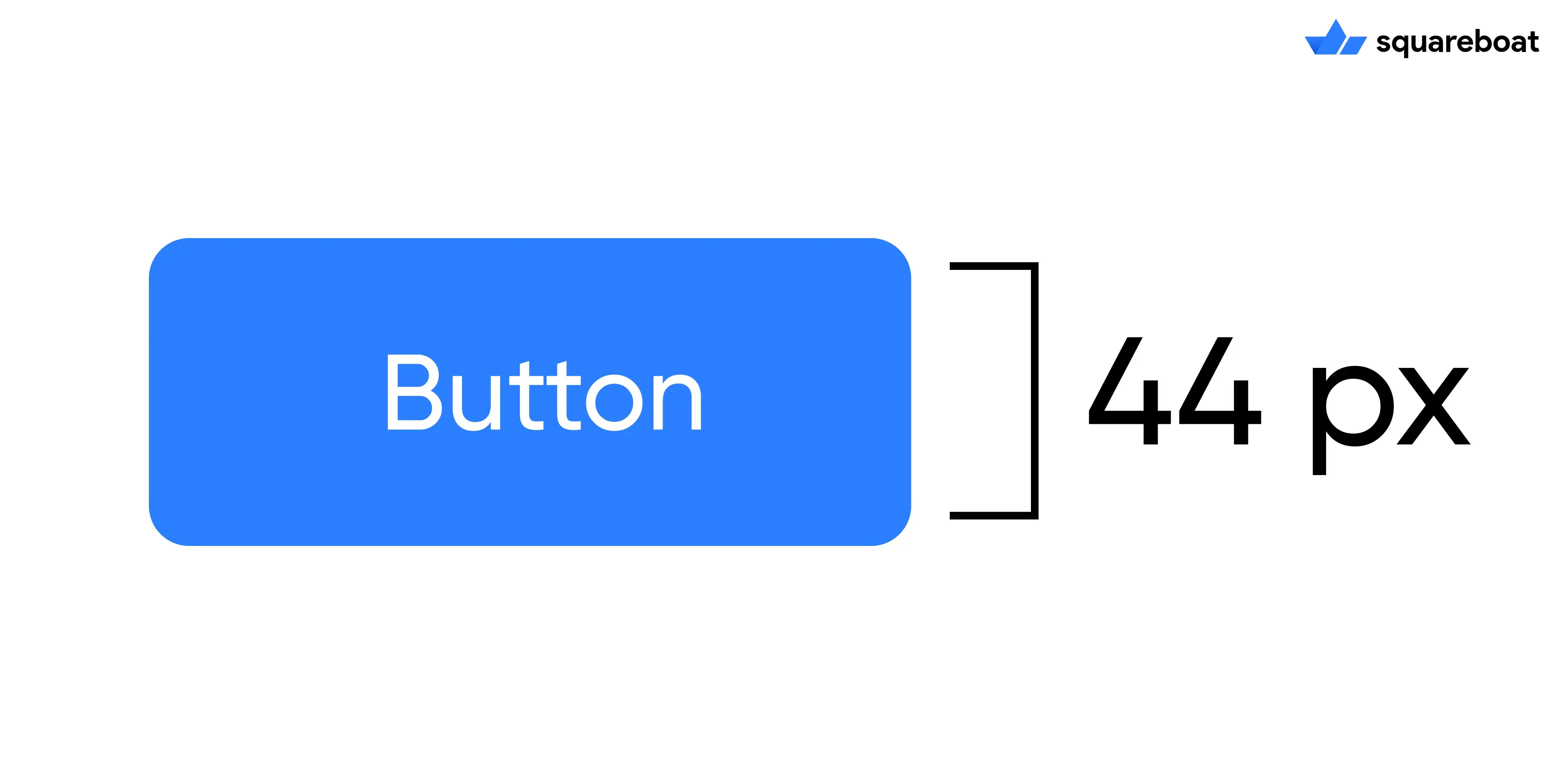
2. Fitts's Law: Make Important Things Easy to Click
Your Buy Now or Get Started button should be large and easy to click. If users have to hunt for it or squint to see it, you're losing sales.
The rule is simple: important buttons need to be big and positioned where users naturally look.
Apple recommends buttons be at least 44 x 44 pixels, as small buttons kill conversions.
What should you know as a decision maker?
Check your CTAs on mobile and desktop. Can users tap them easily?
Are they immediately visible? If not, you are making customers work too hard.
3. Von Restorff Effect: Make Your CTA Impossible to Miss
Items that stand out get noticed and remembered. This is why successful companies use bold and contrasting colors for their action buttons.
HubSpot changed its CTA button from green to red and saw conversions jump 21%.
Other companies report 15-25% increases from strategic color choices alone.
What should you know as a decision maker?
Your CTA button should visually pop against everything else on the page.
Test different colors, but make sure it clearly stands out.
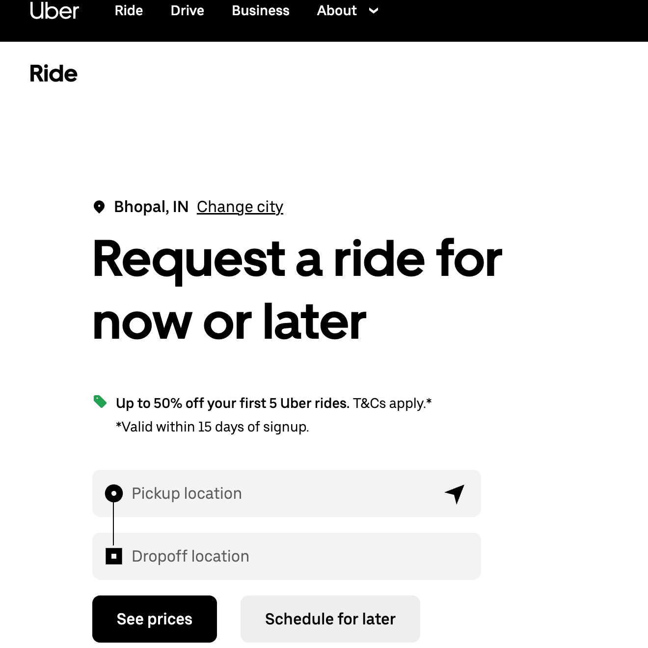
4. Miller's Law: Chunk Your Information
People can only process about 4 pieces of information at once. When you dump everything on one page, users get overwhelmed and leave.
This is why multi-step forms convert 30-80% better than single long forms.
Let us understand it with an example, Uber doesn't ask for your payment method, destination, and preferences all at once.
It breaks the information into smaller chunks. That's Miller's Law in action.
What should you know as a decision maker?
Break complex processes into smaller steps. Show only what's needed right now.
Each additional field or choice you remove increases your conversion rate.
Uber
5. Serial Position Effect: Start and End Strong
Users remember the first and last things they see.
Your homepage hero section creates the first impression. Your final CTA is your last chance to convert.
Both need to be clear and compelling.
What should you know as a decision maker?
Invest extra attention in your homepage design and your checkout/sign-up final screen.
These two moments disproportionately impact whether users convert or leave.
CFO Perspective on Why Investing in UX Makes Sense?
Let’s speak directly to the financial decision-makers here.
You're evaluating UX investment through the same lens you apply to any capital allocation.
What is the IRR? How does this compare to alternative uses of capital?
And critically, what's the opportunity cost of inaction?
Here's what the financial data reveals about UX as an investment class.
1. Considering UX as a Cost Structure Decision
UX investment typically represents 10-15% of total development budget.
But viewing this as a line-item expense misses the fundamental economics.
In manufacturing, quality control at the design stage costs pennies, fixing defects on the production line costs dollars and recalls cost millions.
Software follows the same economic curve just steeper.
2. Micro-Changes, Macro-Impact
The most instructive cases show how seemingly minor UX decisions can lead to disproportionate financial outcomes.
To understand this easily, read the following case study:
An e-commerce company's checkout process required account registration.
The "Register" button created psychological friction where users perceived it as a barrier requiring commitment and future obligations.
The UX insight: Users don't want to "register" they want to complete their purchase.
The change: Replace "Register" with "Continue" and add: "You don't need an account to check out."
Result: $300 million increase in annual revenue.
Why this matters to decision makers?
This wasn't about adding features or increasing marketing spend. This was about removing friction that was actively destroying conversion.
3. Actuarial Cost of Poor UX to Quantify What You Are Losing
Not investing in UX is a decision with measurable negative cash flow.
62% of users who experience poor mobile UX will never purchase from that brand again. This is customer exclusion.
Let’s break it down in simpler calculations that matters to CFOs:
- Company acquires 10,000 new mobile visitors monthly
- CAC: $50 per visitor
- Monthly acquisition spend: $500,000
- Poor mobile UX affects 62%: 6,200 customers permanently lost
- Wasted acquisition capital: $310,000 per month
- Annual wasted spend: $3.72M
Final Thoughts
If there is one takeaway from everything we have covered, it is: design is a business decision.
Every button placement, every micro-interaction, every tiny moment in your product influences whether someone moves forward or quietly disappears.
And as a decision maker, you already know this.
You feel it every time a funnel underperforms or users don’t engage the way they should.
Good design changes the trajectory of the entire product.
So the final question to think about is who are you trusting to build that kind of product?
Because not every UI/UX agency is specialized for this work.
When you are choosing that partner, pay attention to things that actually matter:
- Do they show you their thinking, or just pretty screens?
- Do they talk about conversions, retention, and revenue or just colors and layouts?
- Have they solved problems like yours before?This is why Squareboat stands out.
Our design-first development approach treats UX as the backbone of a successful product.
So, why are you still delaying? Book a free UI/UX audit today.
Frequently Asked Questions
Q.1 Why is mobile UX design important?
Mobile users expect seamless interactions instantly. If your site is difficult to navigate or slow on a phone, potential customers will abandon it immediately without a second thought. This poor experience destroys brand credibility and drives ready-to-buy users directly to your competitors.
Q.2 What are the most common UI/UX mistakes that kill conversions?
The common mistakes include cluttered interfaces that violate Hick's Law, creating decision paralysis. Small, hard-to-click buttons (ignoring Fitts's Law) and low-contrast CTAs also drive users away. Additionally, overwhelming forms without "chunking" information may lead to high bounce rates and abandoned carts at crucial moments in the buyer’s journey.
Q.3 What are the best UI/UX agencies in India?
India hosts renowned agencies like Lollypop Design, YUJ Designs, and NetBramha. However, Squareboat uniquely stands out by integrating high-end design with robust engineering. Their "design-first" approach ensures products are also technically sound and conversion-driven.
Q.4 How often should you update your website's UI/UX design?
You should evaluate your UI/UX every 2-3 years, or sooner if you notice dropping conversion rates. Since trends evolve rapidly what looked modern three years ago may now look outdated. Regular "health checks" and iterative updates often prevent the need for a massive, expensive overhaul down the line.
Q.5 What should I look for when hiring a UI/UX design agency?
While looking for a UI/UX design company, always look for a partner that values solving business problems over just creating pretty visuals. Review their case studies to see if they understand user psychology and conversion principles. They should talk about metrics like retention and revenue to ensure the design aligns with your organizational goals and delivers a measurable ROI.
Aakriti Jain is a UI/UX Designer with 6+ years of experience creating intuitive web and mobile interfaces. At Squareboat, she focuses on user research, wireframes, visual design, and scalable design systems to deliver clean, user-centric experiences
