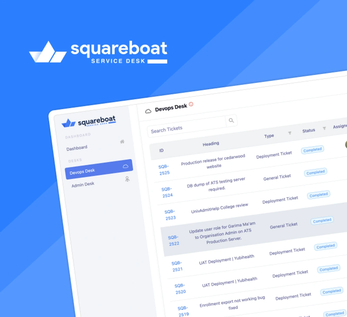
Service Desk
From DevOps to Admin, Command Center for Every Internal Task
Unified design, documentation, and development.

FifthTry Design System is a developer-friendly platform that helps build faster, better, and more consistent UIs by connecting design directly to code. Unlike static design files or outdated libraries, FifthTry treats design like code with versioning, pull requests, and documentation. Designers define structure, tokens, and styles; developers sync them into real, testable components. Each button, form, or layout is built once and reused everywhere. The changes are traceable, synced across projects, and easy to roll back if needed. It fits into your workflow, whether you are using React, Vue, or other frameworks.
Powered by Fastn, the system goes a step further. Fastn brings frontend development closer to design by letting developers work with Figma components as live UI code. The structured, consistent foundation of this system was shaped by Grid Design, with a sharp focus on visual clarity and long-term scalability.
What we built?
FifthTry started with a clear goal: to build a design system that could scale, adapt, and version just like code. We built a living design system where every component is documented and production-ready. For users, this meant less time spent on manual design QA, fewer inconsistencies between mockups and production, and an easy way to manage UI across apps. Every element, color, typography, layout, and interaction is systemized with flexibility in mind. We collaborated closely with designers and product managers to ensure visual patterns could match real-world use cases. With this, we built the FifthTry Design System, which freed designers from repetitive tasks and brought efficiency to every design interaction.
From the earliest tokens to full templates, this system was crafted through our impactful UI/UX design services.
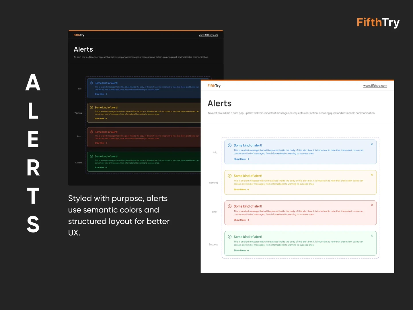
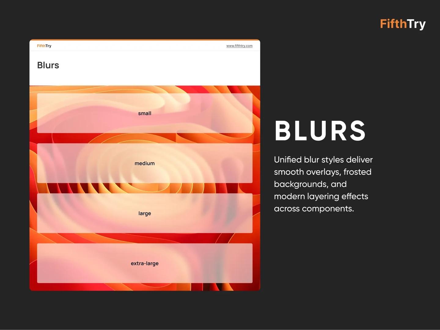
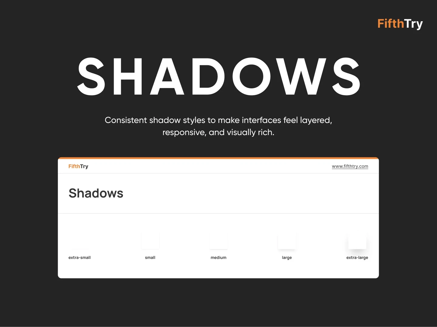
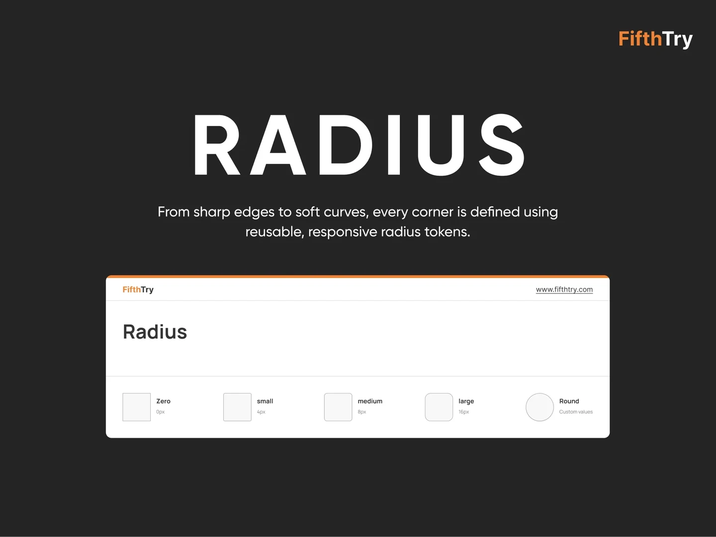
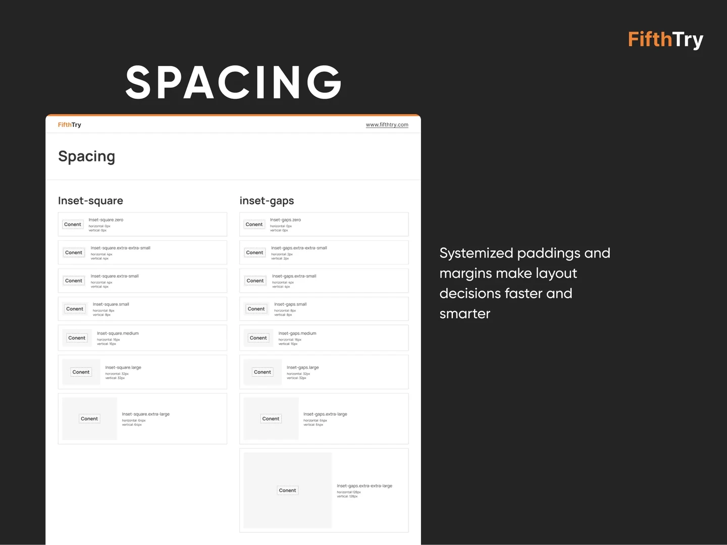
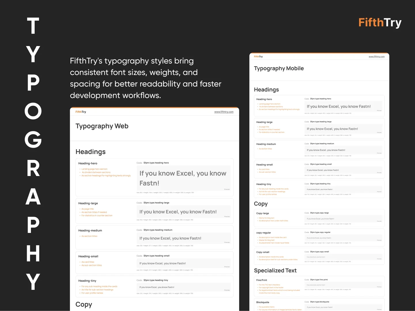
Design Foundations: The FifthTry Design System’s foundation starts with a set of design tokens that standardize colors, fonts, spacing, and visual properties to create harmony throughout the product. Our color system delivers primary, secondary, semantic, and status colors with hover, focus, and disabled states. Typography is structured with a clear hierarchy of font sizes, weights, and styles to enhance readability. The responsive grid and layout system structures the content consistently across all devices.
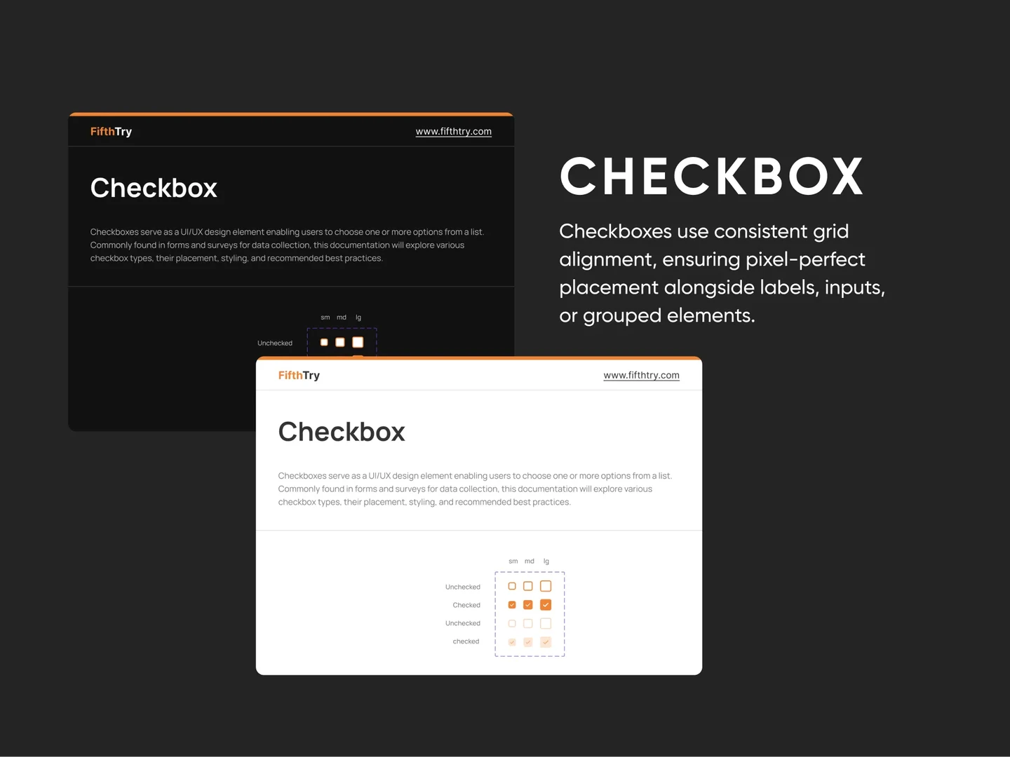
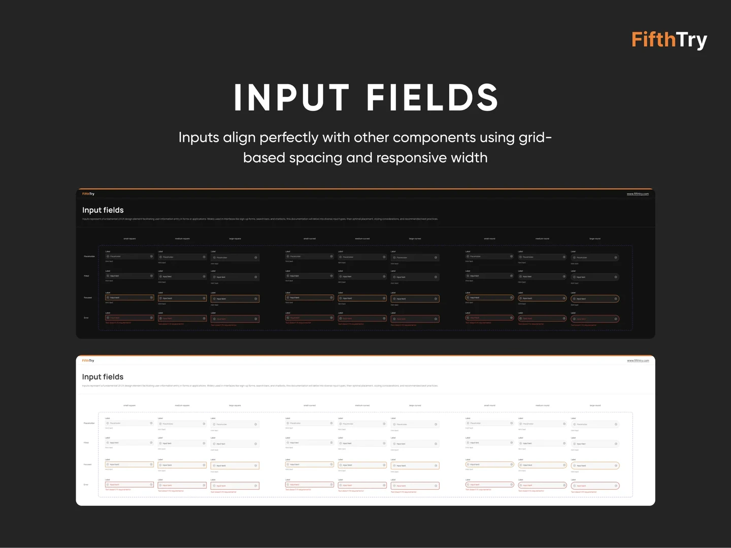
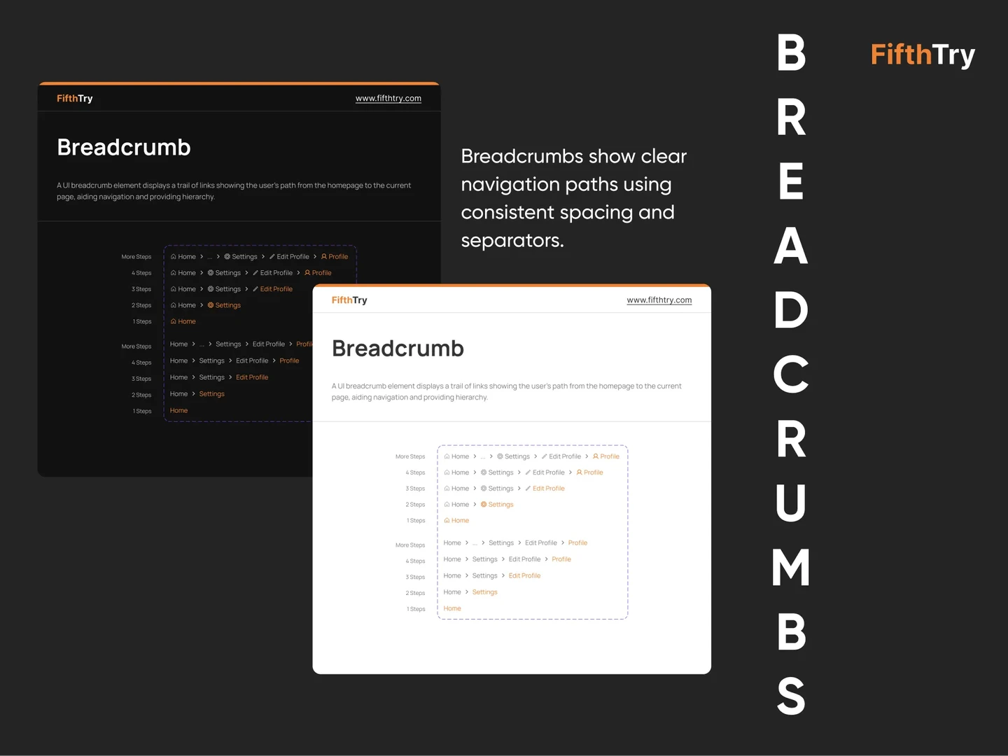
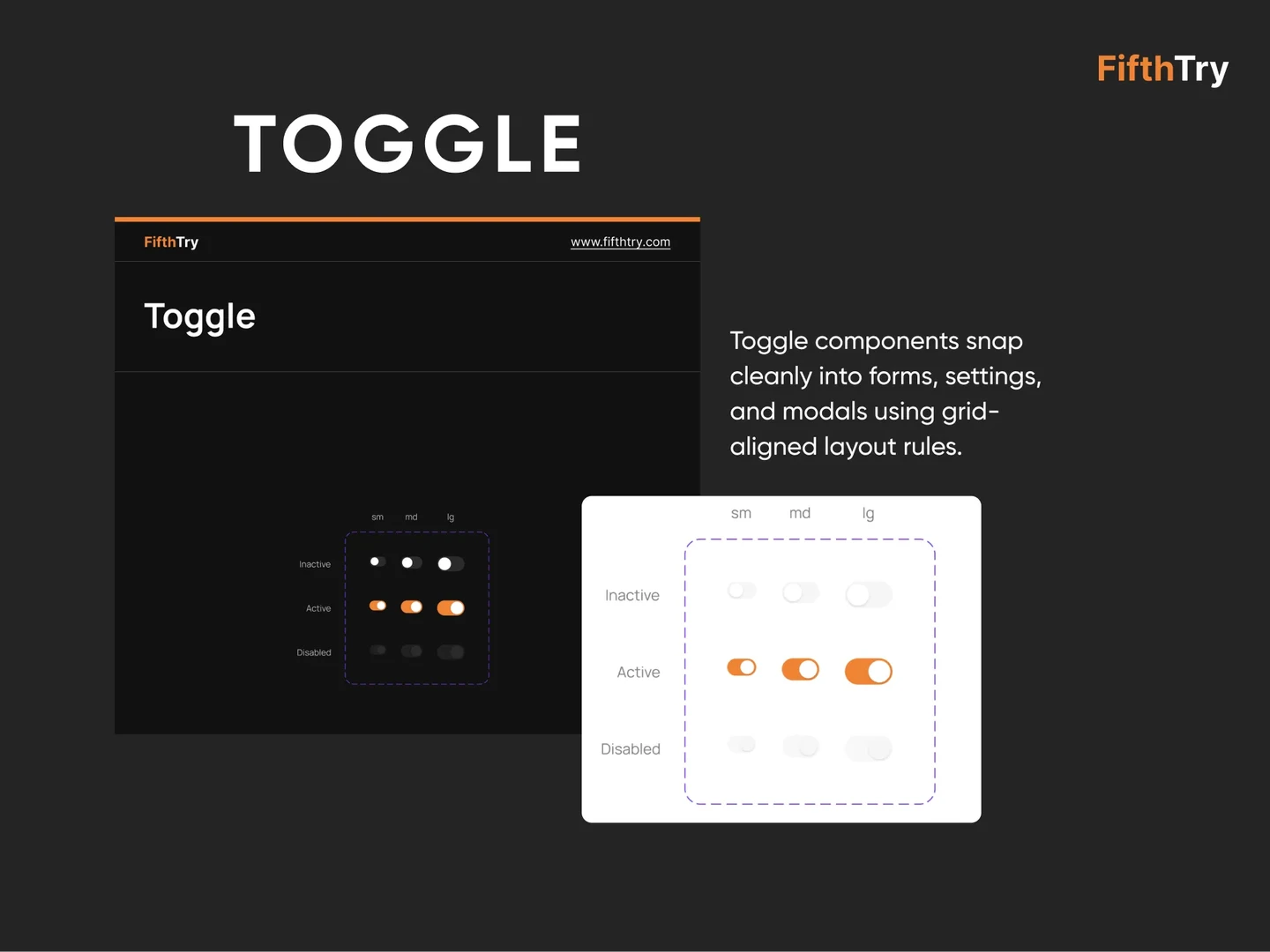
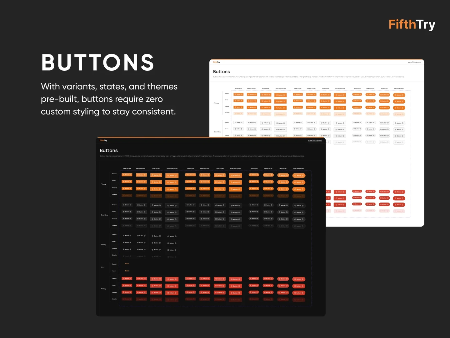
Component Library: We built a component library packed with custom UI elements. The foundational UI elements have all necessary states: hover, pressed, disabled, and predefined. Auto Layout and Variants streamline customizations, helping in fast iteration without clutter. Most importantly, accessibility is prioritized, making it easier to build inclusive UIs without compromising design quality or efficiency.
Patterns and Screens: We created a library of reusable UI patterns, including headers, footers, navigation, modals, and more. To support personalization and branding, we also introduced a range of attractive theme variants with dark and light modes.
Templates: To reduce repetitive design work, we created pre-built page templates ranging from single-page landing pages to multi-section documentation layouts. These templates are fully customizable and perfectly aligned with the rest of the design system components.
The system also includes ready-made screen flows for common UI journeys:
Documentation and Systemization: Components are documented with detailed notes and state visuals. We used a versioned, structured naming model for all tokens, colors, borders, and text styles so that both designers and developers speak the same language.
Tooling and Integration: With Figma at the center of the workflow, FifthTry offers a design system housing all components, documentation, and visual tokens. Every asset is structured and documented for developer handoff. We made sure that all elements are compatible for mobile-first responsiveness and structured for visual consistency.
Similar Case Studies

Service Desk
From DevOps to Admin, Command Center for Every Internal Task
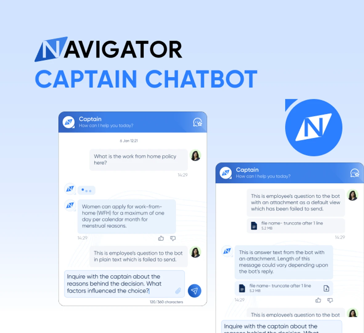
Captain Chatbot
Smooth Sailing Through Your Work Tasks with Captain Chatbot!
Safe Security
Align cybersecurity with business priorities and impact

Safe Security
Align cybersecurity with business priorities and impact
At a Glance